
As much as Dropbox is great on a technical level, the user experience keeps degrading all the time.
Installing it is a complete nightmare of clicking through super slow window transitions and banners begging you to upgrade your account.
Recently I went through the process of deleting my account (again) out of frustration only to find that the already lengthy process had gotten even longer!
Let’s walk through the deletion process as it stands in April 2021 and see how many clicks it takes.
From the file viewer area, you’ll want to click on your profile picture (First click)
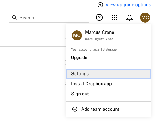
From the dropbown, click on Settings (Second click)
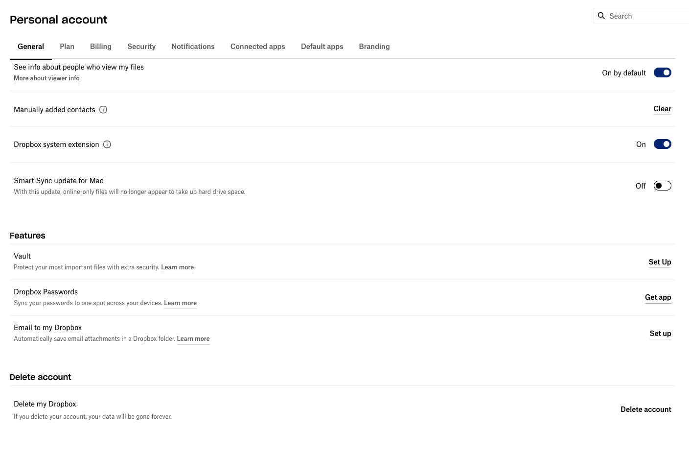
Now that we’re inside the Settings menu, click on Delete account (Third click)
That should be it… right? Done. Simple?
We’re just getting started.
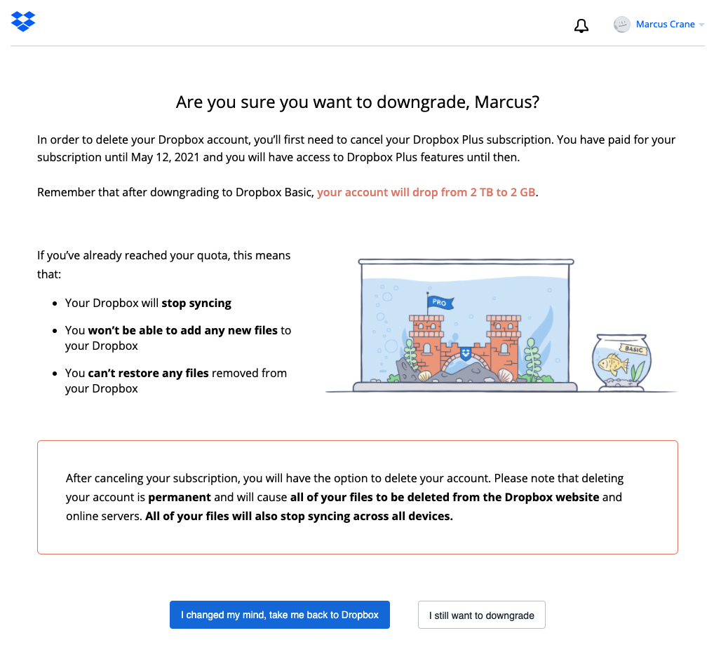
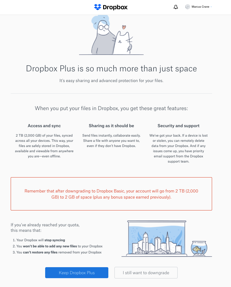
If we really have to, I can handle putting up with one of these pages but come on, the colour coding of these buttons is clearly a dark pattern. I clicked a button called “Delete account” and now the primary action on this page is “I changed my mind”.
Additionally, the wording that suggests I need to cancel my subscription is odd, in that deleting an account is surely the same act as cancelling a subscription.1 Yes, I realise I’m not using this service I paid for. I don’t care.
So anyway, we resist the urge and click on “I still want to downgrade”, which weirdly does not say “Complete downgrade”. You know what that means… (Fourth click)
God, yes! I’m two screens deep already so I’m pretty fucking sure I would like to cancel. I’m not “thinking” of leaving, I already decided that when you started degrading the UI. You could have just shipped nothing for the next 5 years and continued to make bank through word of mouth and the quality of your sync engine.
Hell, even just the lock-in from existing applications already does most of the convincing for me.
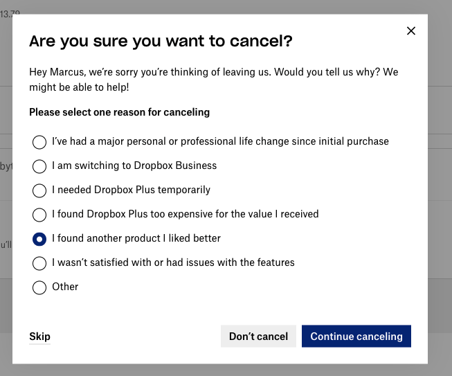
Interesting, the colour coding has switched once again to suggest that “Continue canceling” is now the primary action. Is this to trick me into not cancelling? I also didn’t notice that “Skip” option in the bottom left until now.
(Fifth and sixth clicks)
How many fonts does Dropbox use? None of these screens are even consistent whatsoever.
I don’t have a problem with the product, I have a problem with the marketing department so none of this is helping. If anything, it has the opposite effect of making me want to cancel even further.
The colour coding has changed yet again to suggest “Keep Dropbox Plus” is the primary action.
(Seventh click)
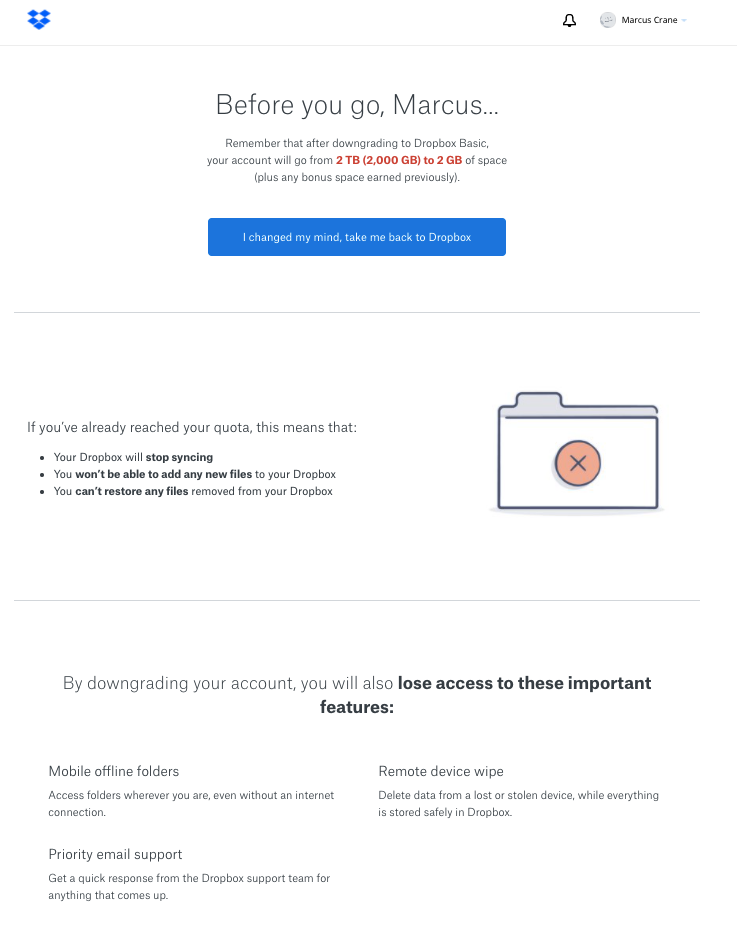
WHAT DO YOU MEAN BEFORE I GO? THIS IS LITERALLY THE SAME INFORMATION PRESENTED FOR THE THIRD TIME. HOW IS THIS A CONVINCING ARGUMENT? I DON’T UNDERSTAND WHY YOU AREN’T EVEN TRYING.
You can’t even see the cancel button on this page. You have to scroll right to the bottom (which I didn’t screenshot) and then click another cancel button.
(Eighth click)

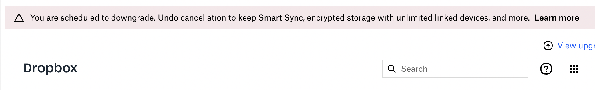
Now originally, this is where I had ended the blog post but I actually went back to Dropbox a few weeks later2 and just discovered this process hadn’t even deleted my account. All I accomplished was that I downgraded my plan which is obvious in hindsight but also, why this much friction just to downgrade a plan then? Just what sort of nightmare will it take to delete my account and do businesses have to go through this hell if you purchase an enterprise plan?!
So, let’s finish this thing off for real.
Back to the home page, we once again click on the user profile and then on Settings
(Ninth and tenth clicks)
Once more, hit the “Delete account” button at the bottom
(Eleventh click)
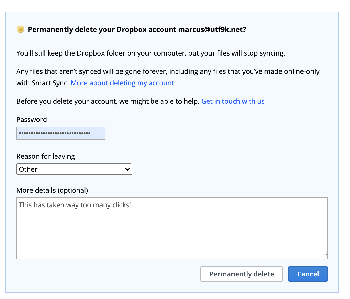
Six3 more clicks to fill in this shitty form and that brings us up to seventeen clicks when I hit “Permanently delete”
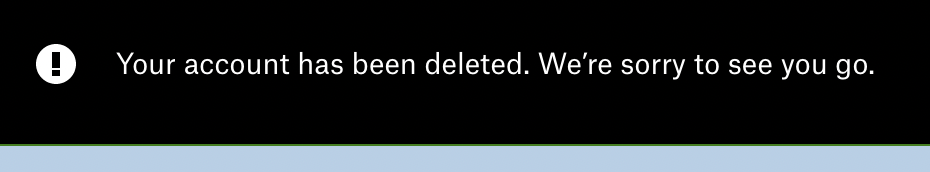
Finally, I’m free.
No company that did this sort of shit ever made me feel excited or even curious about coming back. To this day, I have never resubscribed to The New York Times purely because their cancellation policy requires you to ring a human person in New York.
Why would anyone do this sort of thing? It just screams disbelief in your own product. If you’re so scared of people leaving, it makes me wonder just what kind of mess you’re hiding under the rug.
Anyway, there’s only one thing I have to say to Dropbox after all this:
-
Apparently not as I later found out. ↩︎
-
By which I mean, just now. ↩︎
-
Once on the password field, a second on a popup to autofill from my password manager, a third to open the “Reasons for leaving” dropdown, a fourth to select a reason, a fifth to start entering “More details” and the sixth is when I hit “Permanently delete” ↩︎